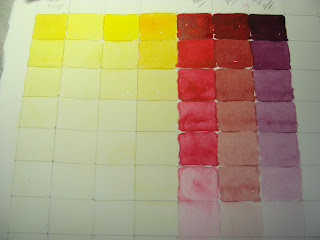
 I've been working on value charts since the beginning of the new year. The first chart I did was with graphite.
Later after visiting http://maggielathamstudios.blogspot.com and her 31 day exercises I started making a value color chart of colors on my palette. As you can see I am not finished.
I created nine one inch squares and added a bit of water to each square as I moved down. It is difficult at times to see values in color. I think this exercise will really help when I am painting.
I have often heard it said that value is more important than color. I know it certainly makes a painting come to life if there are darks and lights for contrast.
Perhaps that is is true in the spiritual realm as well. Love, joy, peace, patience, kindness, goodness, faithfulness, gentleness and self control can add lovely values to life. They bring depth and beauty to the ordinary and make it extraordinary. I think I need to create a chart of these also.
Thank you for the visit. God Bless!


Hi Debbie, these are fabulous. With some colours, such as yellow, it is really difficult to achieve more than five or six values in watercolour. In my opinion value is an important part of painting…get the values right and you can paint the image in whatever colours you want and it will still ‘read’ correctly. I love your idea of creating a ‘value chart’ for the spiritual realm as well.
ReplyDeleteVery thoughtful post!
ReplyDeleteThe value charts are useful :) x
I've always loved doing these types of exercises and can remember doing a graphite value chart just like this one when I was in school. It does indeed help with theory in your work.
ReplyDeleteGreat discipline, Debbie. Your post has encouraged me to get back into my theory exercises. There's so much value in them.
ReplyDeleteWOW! Love the new banner photograph!
ReplyDeleteValue charts are a good resource to have on hand as well as to create before beginning a large painting.
Yours are so organized, I feel inspired.
I am very impressed you have the discipline to do value charts! I have heard how incredibly "valuable" they are - ashamedly, I haven't taken the time to do them. Maybe this will spur me on. I really love your analogy to the spiritual life - those walking with Him reflect the beautiful harmonious colors of the fruits of the Spirit - He provides the perfect "color" chart!!
ReplyDeleteA beautiful post....
ReplyDeleteHow interesting. I never thought of that. It would be nice to create a chart and focus on the extraordinary.
ReplyDeleteHi Debbie. Looks like a lot of us have been encouraged by Maggie to play with our colours. Probably a good thing with all the gloomy weather outside. We need these wonderful juicy vibrant colours to warm us up. Thanks for showing us your grey tonal chart too. I haven't done one of those yet.
ReplyDeleteYou did a good job with the charts...I think the lighter colors are difficult to do. How do you spell extraordinary?
ReplyDeleteD-E-B-B-I-E :)
I always promise myself that some day I will do value charts, but so far it hasn't happened. Good for you! Enjoy!!
ReplyDeleteI need to do this. You are encouraging me.
ReplyDeleteI hope you have a great weekend. It is so cold here. Might snow again tonight. Hope it waits til we get home from a party we are attending.
ReplyDeletewell said deary.
ReplyDeleteerin
xxoo
I think the last time I did a value chart was in high school. What a great idea...I need to do it again. Great post! Thank you!
ReplyDelete